Why Is the Save Button a Floppy Disk? The Tiny Design Mistakes We Refuse to Fix
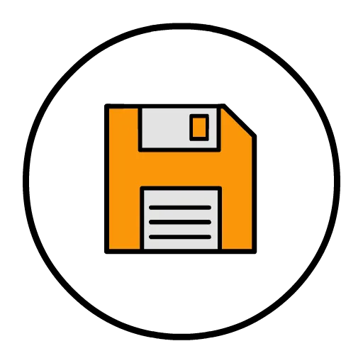
Photo: Kurt Kaiser, CC0, via Wikimedia Commons
Look at the corner of almost any app on your phone. There it is: a small square icon with a folded corner, telling you to save your work.
You have not touched an actual floppy disk in years. Many people using that icon have never touched one at all. And yet we all understand it instantly, without explanation, across every language on Earth.
How did a piece of dead technology become one of the most successful symbols in human communication? And why does stuff like this keep happening?
Icons Outlive Their Bodies
The floppy disk earned its place honestly. In the 1980s and '90s, saving a file meant physically inserting a disk. The icon was literal — a picture of the thing you were about to use.
Then the object vanished. The icon didn't. Designers have tried replacing it with arrows, downward triangles, and abstract shapes. Users revolted, or more accurately, didn't understand the alternatives. The floppy disk won not because it made sense but because it had already been learned, and nobody wanted to pay the cost of relearning.
This is a recurring pattern in design: the symbol outlives the thing. We don't draw a picture of a physical envelope when we email, but the envelope icon survived anyway. We 'dial' phone numbers on glass screens. We 'hang up' by tapping a red circle. Our interfaces are a museum of metaphors for machines that no longer exist.
The 404: An Error Message That Became a Personality
The 404 'Not Found' error is another accidental icon. The number came from a database at CERN in the early 1990s — room 404, according to popular legend, where the web's files lived (the legend is probably apocryphal, but it's stuck). The technical fix would have been a friendlier message. Instead, the internet did something better: it turned 404 into a creative genre.
Today, companies compete to make the most charming 404 pages — lost astronauts, sad cartoons, jokes about missing pages. An error message designed to be invisible became one of the few places where the web shows personality. That's not a design decision. That's folklore.
The Keypad That Won by Committee
Here's one most people get backwards. Calculators put the 7-8-9 row on top. Phones put it on the bottom. Why?
When Bell Labs designed the push-button phone in the 1950s, researchers tested dozens of layouts with real users. The calculator layout (top row high) and the phone layout (bottom row high) both performed well — but phone engineers reportedly worried about dialing errors from people used to calculators, and chose the opposite arrangement deliberately. The decision was made by committees running user tests before most Americans had touched a keypad of any kind.
That layout is now hardwired into billions of phones, keypads, ATMs, and door locks. A 1950s usability test is running your thumb, right now.
Why We Never Fix These Things
There's a real principle at work, and designers call it the cost of change. Once a billion people know a symbol, changing it isn't a design decision — it's a global retraining program. Familiarity isn't just convenient; it's a form of infrastructure.
But there's a second, softer reason: we like these ghosts. The floppy disk is charming. The 404 page is playful. The quirks make our digital world feel slightly handmade, slightly historical — like exposed brick in a renovated loft.
The Icons of the Future Are Being Chosen by Accident
Here's the fun part: somewhere right now, a symbol is being created that people will still be using in 2080, long after whatever it depicts is obsolete. Maybe it's the pull-to-refresh spinner. Maybe it's the heart button. Maybe it's something an AI interface does that we haven't even named yet.
Whatever it is, it probably wasn't designed to last. It just happened to be there when a billion people needed a shortcut — and then it stuck, the way the floppy disk stuck, the way the envelope stuck.
Design doesn't just shape technology. Sometimes, by refusing to update, it preserves it — little fossils embedded in every screen, quietly reminding us where we've been.
The next time you tap a picture of a floppy disk to save a file in the cloud, take a second to appreciate it. You're not using an icon. You're using a monument.